How to satisfy MHRA guidance on human factors and usability when designing medical apps
Chief Product Officer, Paul Cooper, gives practical advice on how to achieve Medicines and Healthcare Products Regulatory Agency (MHRA) standards for the usability of software designed for medical devices
- Product iteration and improvement throughout the life-cycle
- Post-market vigilance and surveillance of similar devices
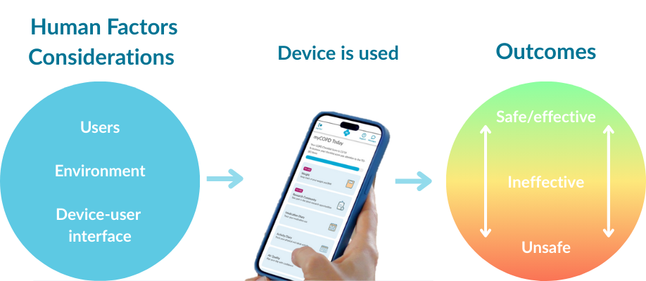
- Human factors considerations that promote optimal clinical outcomes
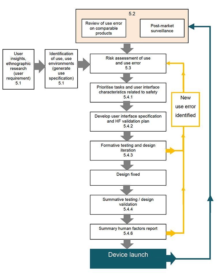
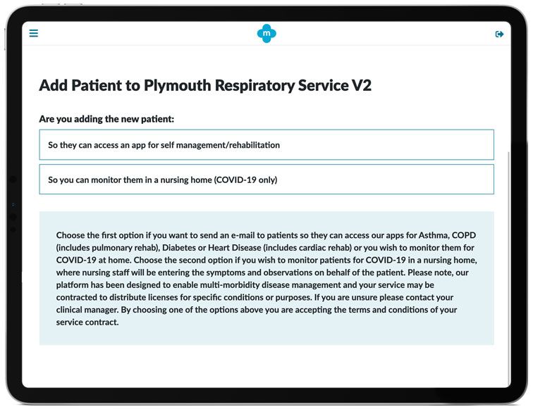
A recent example of the success of an iterative design process, and in particular, using formative user-testing as a method to identify risks, are improvements we made to the COVID-19 Virtual Ward app. During alpha-testing with a cohort of care home nurses, we observed an issue where some carers needed to enter patient data themselves because the patient didn't own a smartphone or computer. So, we designed a new function that enables clinicians to register patients on their behalf.
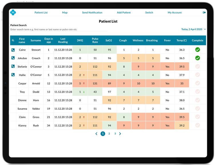
Another example of the iterative design process: during the Tees Valley NHS Vanguard Unit trials by Hartlepool & Stockton Heath GP Federation (H&SH) on the COVID-19 Virtual Ward, in-depth user-research was conducted, and usability issues were identified that resulted in a design improvement to the patient list in the clinical app. We knew that nurses were using the app to telephone patients and request their symptoms over the phone, thereby enabling the nurse to enter the data on behalf of the patients. But only when interviewing the users did we fully appreciate the real-life complications of their workload. The nurses needed a way to identify who to contact from a long list of patients. The problem caused an increase in the amount of time to make the phone calls and impacted on the nurse’s efficiency. The simple solution of indicating this type of patient and including a checkbox to mark that the results had been assessed solved this issue.
Carl Gowland Head of Operations & Service Delivery at H&SH told us:
"The COVID-19 Virtual Ward app is really straightforward to use. By working directly with my mhealth to make changes based on our clinician’s experience when testing the app, we’ve been able to work more efficiently and help more patients during the COVID-19 pandemic."
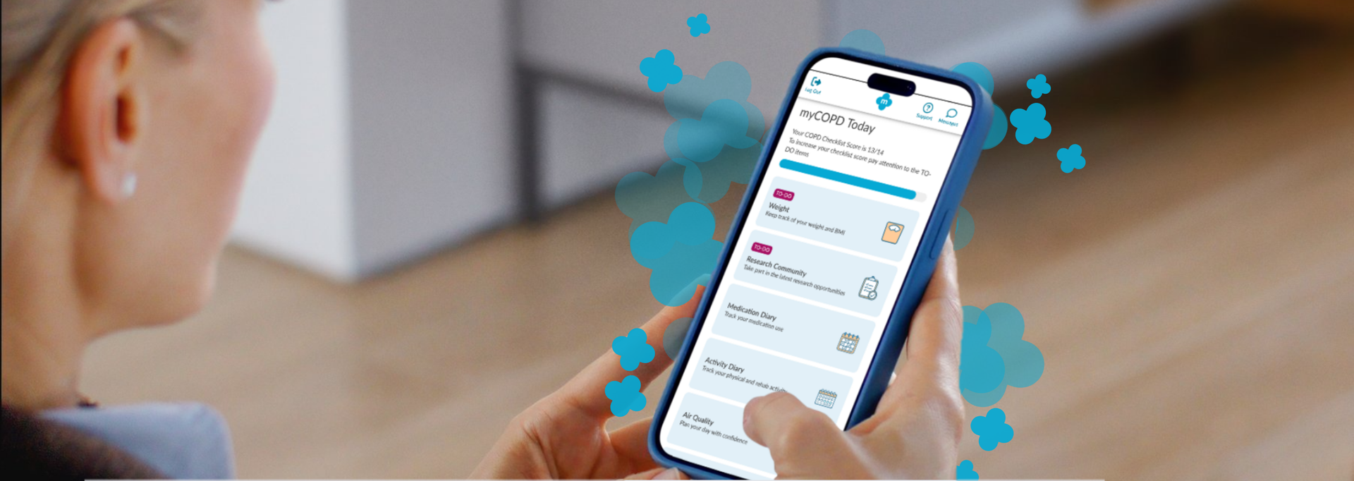
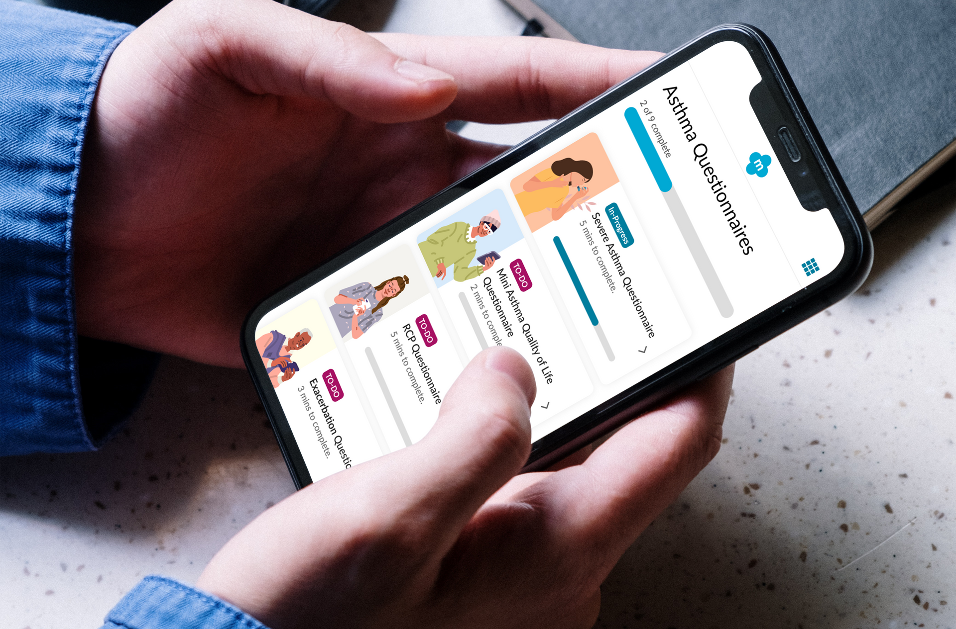
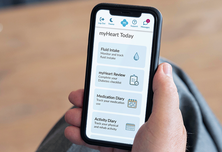
Another success story of this user-centred design process is a post-market improvement made to the medication diary.
Following usability and ethnographic research with different patient types, our research team understood that the amount and frequency of medication required for all the conditions supported by the apps varied significantly from patient to patient. Some patients took up to ten different meds every day, therefore individually re-entering the same medicine every day was a significant time investment.
The solution, to ask patients to enter their meds once, then enable them to tap a "copy yesterday’s meds" button, has helped thousands of patients save time, and reduce the risk of error significantly.
These are just a few examples of how my mhealth have successfully followed a user-centred design approach within a formative and summative assessment research model to make patients and clinicians lives easier and less prone to risk.
If you're interested in hearing more about how we've shaped our design process to conform to the "MHRA Human Factors and Usability Engineering Guidance for Medical Devices", or would like to license our software to help your patients please get in touch here or call us on +44 (0)1202 299 583.
